Web Design Trends We’re Loving for 2025
Web design is always evolving, and 2025 is shaping up to be a year of exciting, bold changes. Designers are embracing color, creativity, and functionality in ways that make websites not just beautiful, but also engaging and easy to navigate. At Mash Creative Co., we’re loving a few specific trends that we believe will dominate the web design landscape in 2025. From vibrant colors to user-friendly layouts, here’s what we can’t get enough of.

1. Color: Bright, Bold, and Purposeful
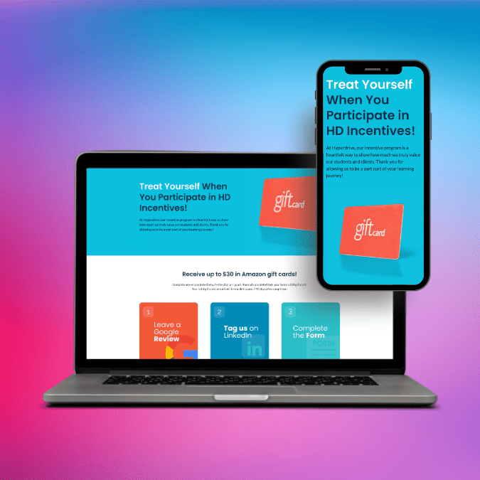
One of the standout trends for 2025 is the use of color in web design. Gone are the days of overly minimalist designs with muted tones; today’s websites are embracing full-out colorful designs that pop off the screen. Bright hues and dynamic palettes are being used to make a statement, give brands a unique identity, and create an immersive experience for users. Think vivid gradients, bold backgrounds, and high-contrast elements that draw the eye and keep users engaged.
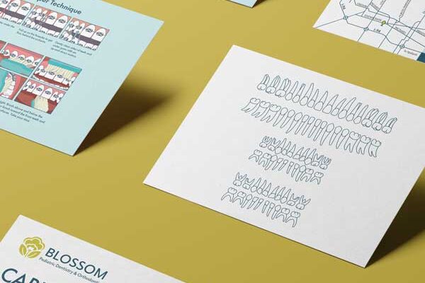
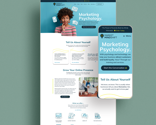
But it’s not just about going all-out with color. On the other side of the spectrum, we’re also seeing a surge in minimalist designs that feature lots of white space, punctuated by pops of color and rich, high-quality photography. This trend strikes a balance between visual impact and simplicity, making it perfect for brands that want a clean, elegant look while still injecting personality into their design.
In either case, color is being used more thoughtfully than ever before, enhancing user experience (UX) and guiding visitors through the website with a seamless blend of form and function.
2. Bento-Box-Style Sections: Organized and Impactful
Another trend we’re loving is the bento-box-style layout. Inspired by the organized, compartmentalized nature of a traditional Japanese bento box, this design technique breaks a webpage into neat, bite-sized sections that make information easy to digest. Each box or section can feature different types of content, such as text, images, or videos, all while maintaining a cohesive and visually appealing structure.
The bento-box style is perfect for websites with a lot of information to convey, as it prevents content from feeling overwhelming. It also makes navigation simpler and more intuitive, allowing users to quickly find what they’re looking for. Plus, the organized, grid-like appearance adds a sleek, modern aesthetic that’s both functional and attractive.
3. Large, Bold Header Text: Making a Statement
Typography is a critical element of web design, and in 2025, we’re seeing a clear trend toward large, bold header text that commands attention. Websites are using oversized fonts to make powerful first impressions, with headlines that grab the user’s eye the moment they land on the page. This trend is about creating impact with fewer words, using typography to communicate the brand’s message quickly and effectively.
Large, bold headers also help break up content, making the website easier to scan. With attention spans shorter than ever, this design approach ensures that visitors can absorb key information at a glance before deciding whether to explore further. It’s a bold, modern, and highly functional way to structure content, and we’re loving how it pairs with minimalist design elements for a clean, professional look.
4. Functionality: Fun, Yet User-Centered
While creativity is flourishing in web design, functionality remains the cornerstone of a successful website—and for good reason. Too many websites today lean into flashy animations and interactive elements that look cool but end up confusing users and performing poorly on search engines, like Google. These animations can slow down the website or make navigation difficult, detracting from the overall experience.
In 2025, we’re seeing a resurgence of designs that prioritize functionality while still incorporating fun, engaging elements. Designers are finding ways to introduce movement, interactivity, and animation without compromising usability. Think subtle hover effects, smooth scrolling, and animations that guide the user’s attention without overwhelming them. The goal is to create websites that are not only visually interesting but also easy to navigate, fast to load, and intuitive to use.
At Mash Creative Co., we believe that functionality never goes out of style. A well-designed website should blend creativity and usability in a way that keeps users engaged while helping them find the information they need with minimal effort (check out our case studies for examples).
Conclusion: Blending Creativity and Usability in 2025
As we move into 2025, web design is all about finding the sweet spot between bold creativity and user-centered functionality. From vibrant colors and clean typography to bento-box-style layouts and seamless user experiences, the trends we’re loving right now reflect a balance of form and function. It’s an exciting time for web design, with endless possibilities for brands to stand out and connect with their audience.
At Mash Creative Co., we’re excited to help businesses embrace these trends and create websites that are as beautiful as they are effective. Whether you’re looking to revamp your existing site or build something brand new, we’re here to help you navigate the future of web design.
Let’s make 2025 your year for bold, impactful, and functional web design. Reach out to us today to get started!


